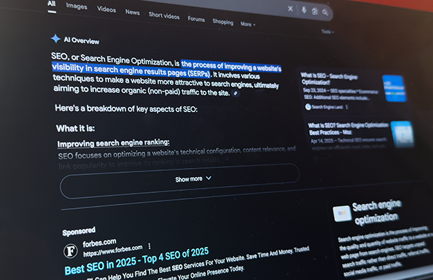
As artificial intelligence (AI) has seen rapid development and growth over the past two years, AI te...
As artificial intelligence (AI) has seen rapid development and growth over the past two years, AI te...
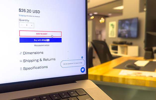

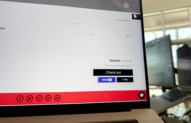
New research indicates that e-commerce sales will reach $6.8 trillion by 2028. Regardless of whether...
A recent study by marketing automation platform Omnisend found that, compared to other types of sign...

Regardless of whether you’re an e-commerce start-up, a large business looking to overhaul their curr...

If your company has a website with a contact form, then you’ve likely received some version of the f...

As marketers, it’s our goal to create helpful, informative, and engaging content that delights reade...